Role
Solo UX/UI Designer
Type
Personal Redesign Project
Tools
Figma · FigJam
Project Context
Wave is one of the most widely used mobile money apps in West Africa, with millions of users sending and receiving money daily. Despite its popularity, the app has notable UX weaknesses that create friction in everyday usage. This personal project is a full UX redesign — analyzing what's broken, defining solutions, and delivering a modern interface.
UX Audit — What's Broken
Before designing anything, I conducted a thorough audit of the existing app to identify friction points:
Complex Navigation
Core actions like sending money require too many steps. Users lose their way in long flows.
Weak Visual Hierarchy
Balance, transactions, and CTAs lack visual priority. Users scan but don't find what they need.
Low Accessibility
Several contrast ratios fail WCAG standards, reducing readability for a large portion of users.
Poor Contact Management
No clear interface for finding, adding, or managing beneficiaries — a core use case.
Weak Brand Identity
Inconsistent visual language across screens. No strong design system holding it together.
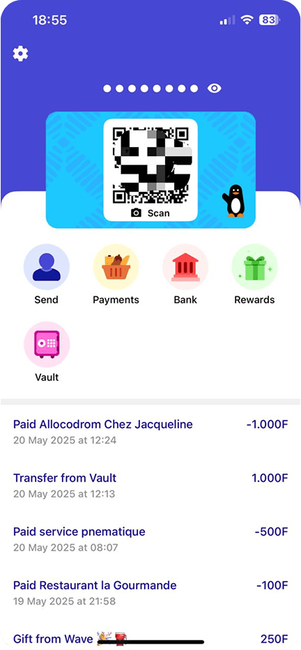
Original Wave interface
UX Strategy & Solutions
Following the audit, I defined a user-centered approach to address each pain point:
Navigation Redesign
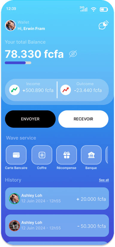
Restructured bottom nav to surface the 3 most-used actions (Send, Receive, Balance) within one tap. Removed unnecessary steps from the transfer flow.
Visual Hierarchy System
Applied a clear typographic scale and spacing system. Balance is now the hero element; CTAs are high-contrast and prominently placed.
Accessible Color Palette
Rebuilt the color system to meet WCAG AA contrast requirements across all text sizes, improving readability for all users.
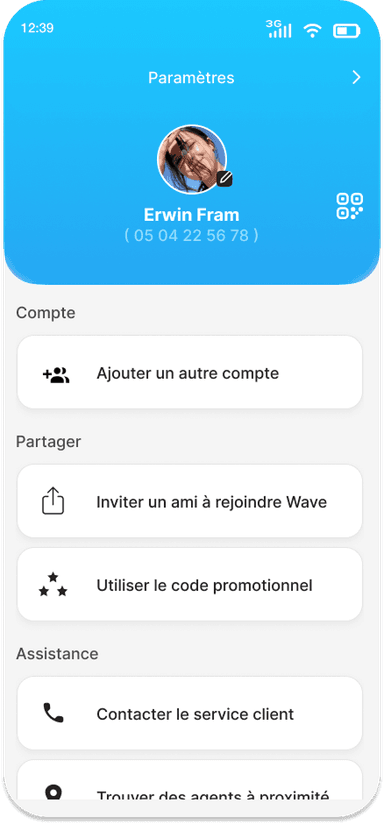
Beneficiary Management
Designed a dedicated contacts screen with search, recent contacts, and clear add/manage actions — reducing friction for repeat transfers.
Consistent Design System
Created a component library (buttons, cards, inputs, modals) ensuring visual consistency across all screens.
Design Screens
Reflections
This redesign deepened my understanding of the unique challenges of financial UX — security perception, trust signals, and accessibility. It also gave me practice building a complete design system from scratch and maintaining consistency across 20+ screens.
“The best fintech UX is the one that feels invisible — the user moves money without ever feeling like they're operating software.”