Role
Solo UX/UI Designer
Type
Personal Concept Project
Tools
Figma · FigJam · Protopie
Project Context
MoovyFlix is a concept streaming app designed entirely from scratch. The challenge: compete with Netflix, Prime, and Disney+ by solving the UX problems they still haven't fixed. I used this project to practice the full design process — from user research to a polished, interactive prototype with a complete design system.
Problem Statement
After analyzing 3 major streaming platforms as a user, I identified recurring pain points:
Cluttered home screens that overwhelm rather than guide the user toward content.
Poor content recommendation — “continue watching” buried deep, no smart suggestions.
Weak search and filter — hard to find content by genre, language, or mood.
No visual distinction between movies, series, and documentaries at a glance.
User Persona
Kofi, 27 — Urban Professional
Watches 2–3h of content per evening after work
Goals
→ Find something good to watch fast
→ Pick up where he left off easily
→ Discover new content without effort
Frustrations
✗ Spends 15 min choosing, then gives up
✗ Forgets where he stopped in a series
✗ Recommendations are irrelevant
UX Solutions
Smart Home Screen
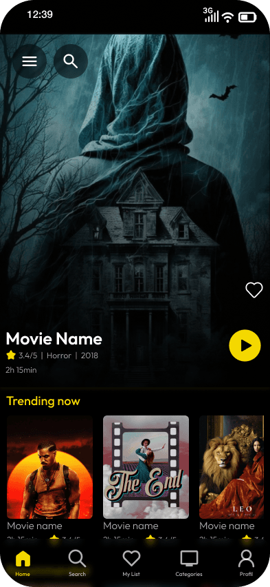
Organized into clear zones: "Continue Watching" at the top, then "Trending", "New Releases", and "For You" — each with a clear visual hierarchy so users find content in seconds.
Advanced Filter System
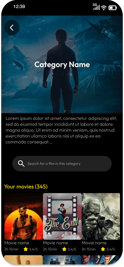
Search by genre, format (movie/series/doc), duration, language, and mood. Users can discover by what they feel like watching, not just what they know.
Immersive Detail Page
Full-bleed hero with trailer preview, synopsis, cast, user ratings, and content tags. A prominent play button with resume detection.
Dark-First Design System
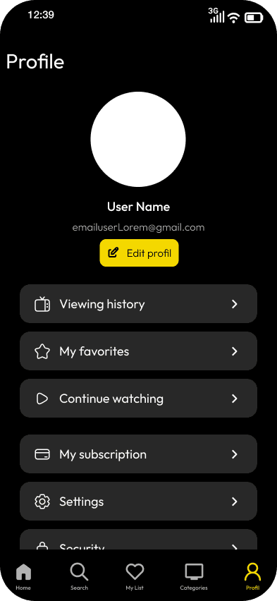
Built a full dark-mode design system optimized for evening/low-light viewing — high contrast content cards, muted backgrounds, cinematic feel.
Mini-Player & Continuity
A floating mini-player persists while browsing. "Continue Watching" is always visible on the home screen — no hunting required.
Screens
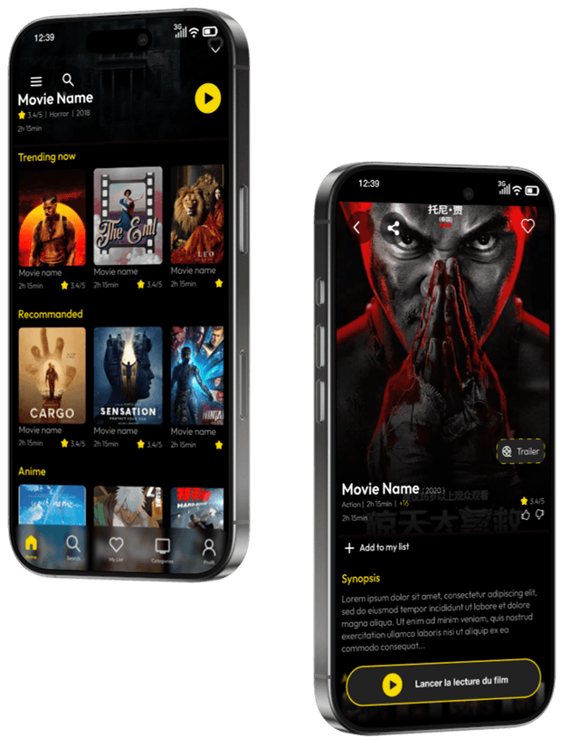
Onboarding
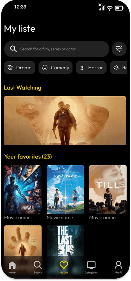
Home
Content Detail
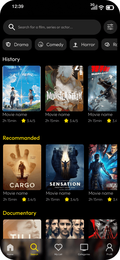
Search & Filter
Profile
Player
Reflections
MoovyFlix sharpened my ability to design complex information architectures and content-heavy interfaces. Building a full design system for dark mode taught me how to handle contrast, color, and readability at scale. It also deepened my understanding of how personalization drives retention in consumer apps.
“In entertainment UX, reducing the time to first play is the metric that matters most. Every decision I made was tested against that criterion.”