Role
Solo UX/UI Designer
Type
Personal Concept Project
Tools
Figma · FigJam
Project Context
Gripple started from a personal observation: existing social networks are engineered for addiction, not connection. Infinite scroll, algorithmic manipulation, and notification overload make them exhausting to use. I asked: what would a social app look like if it were designed for meaningful interaction instead of maximum engagement time?
Problem Statement
Infinite scroll and algorithmic feeds trap users in passive consumption loops.
Notification overload creates anxiety and compulsive checking behavior.
Vanity metrics (likes, follower count) distort self-expression and genuine connection.
Feature bloat — Stories, Reels, Shops, Ads — clutters the core social experience.
Design Principles
Intentional by Design
No infinite scroll. Feed has a visible end. Users browse with purpose, not compulsion.
Content First
No like counts visible to others. No follower vanity metrics. Your posts stand on their content alone.
Calm Interface
Generous whitespace, muted palette, no flashing notifications. An app that respects your attention.
Key Features Designed
Sign up / Login with clean onboarding
Create posts — text, photo, video — with minimal friction
Minimalist feed with no algorithmic manipulation
Thoughtful reactions (beyond just likes)
Follow system with mutual connection focus
User profile — bio, posts, no public vanity metrics
Notification center with calm, grouped alerts (not red badges)
Screens
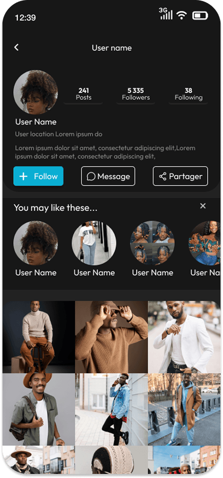
Home Feed
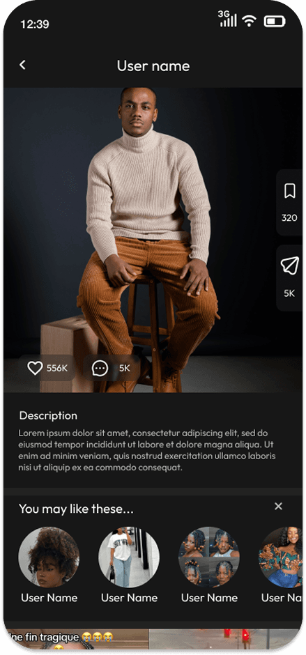
Post Detail
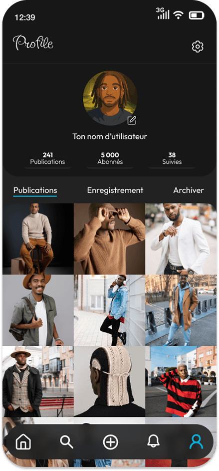
Profile
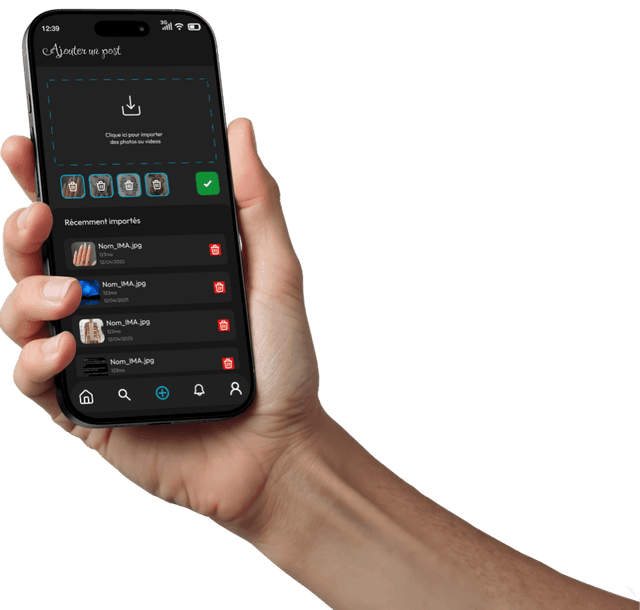
Create Post
Reflections
Gripple taught me how powerful design constraints can be. By deliberately removing features (infinite scroll, public like counts), the interface became cleaner, calmer, and more honest. This project deepened my understanding of ethical design — and how the choices we make as designers shape user behavior at scale.
“The most powerful design decision I made on Gripple was what to remove. Every deletion was a deliberate act of respect for the user's attention.”